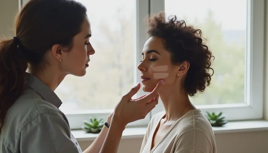
I’ve watched women stand at a beauty counter, swipe three different foundations onto the back of a hand, and choose the one that “looks right” under warm store lighting. Then they step outside, and suddenly they’re orange. Or pink. Or gray. The problem isn’t their eye — it’s that matching your undertone is harder than it looks, and most of the advice out there makes it worse.
Undertone is the color underneath the surface of your skin: warm, cool, neutral, or somewhere in between like olive. Skin depth — how light or deep you are — is separate. You can have fair skin with a warm undertone, deep skin with a cool undertone, or anything else. Most foundation mistakes happen when we confuse the two, or when we rely on tests that don’t actually work. Here’s how I match undertone in my kit, and how you can do the same at home.
Why Every Swatch Lies
Foundation swatches lie because of context. The color you see on a swatch is influenced by the skin underneath it, the light in the room, the color of your clothing, and how the product dries down. A pink-toned foundation can look neutral on a pink surface. A warm foundation can look ashy on skin with surface redness. The swatch itself hasn’t changed — the conditions around it have.
Oxidation Changes the Color
Many liquid foundations darken or shift after they dry. A shade that looks perfect when wet can turn half a shade deeper and more orange by the time you leave the store. That’s why swatching and buying in the same visit is risky. I always wait at least ten minutes, preferably twenty, before making a final call.
Store Light Is Not Real Light
Counter lighting is designed to make products look appealing, not accurate. Warm bulbs make everything look warmer. Cool LED lights make everything look bluer. The only light that tells the truth is daylight, or light that closely mimics it.
The Wrong Ways to Test Undertone
I used to tell clients to look at the veins on their wrist. Green veins mean warm, blue veins mean cool, right? Not exactly. That trick works for some people and fails for many others — especially anyone with olive undertones, surface redness, or darker skin where veins are less visible.
The Wrist Test Problem
Your wrist is not your face. It often has less surface redness, less sun exposure, and a different texture. A foundation that matches your wrist can look completely wrong on your jaw and neck. I stopped using wrist swatches years ago.
The “What Jewelry Looks Better” Question
Gold versus silver is a helpful clue, but it’s not a measurement. Your personal preference, hair color, and even the clothing you wear that day can change how jewelry looks on you. Use it as a hint, never as a verdict.
The Swatch Method I Use on Every Client
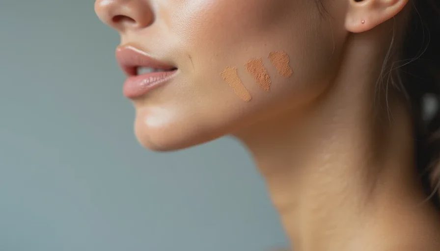
I swatch on the jawline, not the wrist, not the cheek, and not the hand. The jawline is where your face meets your neck, and that’s where a mismatched undertone shows up first. Here’s the exact process.
Step 1: Prep a Clean Canvas
Remove any existing makeup from the jawline and upper neck. If there’s surface redness, don’t try to cover it — work around it. Your undertone is underneath the redness, not on top of it.
Step 2: Pick Three Shades, Not One
Choose three shades that look close to your skin depth: one that appears neutral, one that appears warmer, and one that appears cooler. They should be the same depth, not different depths. Comparing undertone only works if depth is constant.
Step 3: Apply Vertical Stripes
Apply a vertical stripe of each shade from the middle of your jaw down onto your neck. Don’t blend. Blend too early and you lose the comparison. Let the stripes sit.
Step 4: Wait for Oxidation
Wait ten to fifteen minutes. Go outside or stand by a window with daylight. Take a mirror. Do not judge under bathroom light. The stripe that disappears into the neck is the right undertone. The ones that look too orange, too pink, too gray, or too ashy are wrong.
Step 5: Check Again in Different Light
One light source can fool you. I check swatches in daylight, then in indoor light. The right shade should look acceptable in both, not perfect in one and terrible in the other.
What Undertone Is Not
Undertone is not the same as how tan you are. I’ve had clients who thought they were warm because they tan easily, but their neck and chest were clearly cool or neutral. I’ve had clients with rosacea who thought they were pink, when their undertone was actually warm olive. Surface redness throws off every self-assessment.
If you have redness, match your foundation to your neck and chest, not your cheeks. Your face will look more even, and you can spot-correct redness with concealer or a color corrector instead of choosing the wrong undertone.
The Cases That Taught Me the Most
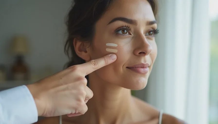
One client came to me convinced she was cool-toned. Every foundation she bought looked pink, so she assumed she was pink. In natural light, her neck had a faint green-gold cast — she was actually warm olive. The pink foundations she’d been buying looked okay on her cheeks because of surface redness, but they turned gray on her neck. Once we switched her to a warm olive shade, her whole face settled.
Another client was the opposite. She always chose warm shades because she loved a golden look. But in daylight, those shades pulled orange on her jawline. She was actually neutral-cool. The warm tones looked good in a warm bathroom, but the moment she stepped outside, the mismatch appeared.
These cases are why I never trust a first impression. Undertone reveals itself only under natural light, on the right part of the body, after oxidation.
The Real Goal of Undertone Matching
Matching your undertone isn’t about obeying a color theory chart. It’s about making your foundation disappear so that your face and neck look like the same person. That’s it. The right undertone is the one that makes people notice you, not your foundation.
And if you’re between undertones — which many people are — don’t force yourself into one box. Neutral shades exist for a reason. So do products designed for olive skin. The goal is a match, not a label.

No notes yet — write the first one.